The Japanese Paper Place
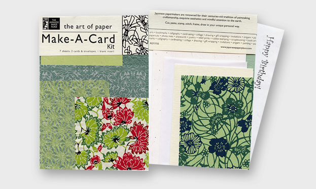
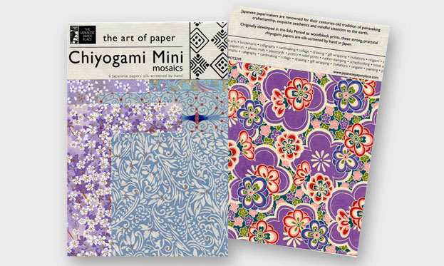
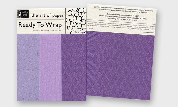
The Japanese Paper Place called upon Purple Moon Creative to develop a brand identity for a line of paper products sold through partnering retailers. The challenge was to design a packaging template that would showcase these beautiful papers, while enhancing the brand’s artisan image. Inspired by historic Japanese paper patterns, we illustrated lovely icons that work with the company logo and our tagline “The Art of Paper” to create a clean, classic look that can be applied to all their product packages. The beauty of the design is its zen-like simplicity, which allows the unique papers to take centre stage. Project elements:
Package Design for more than 20 skus


