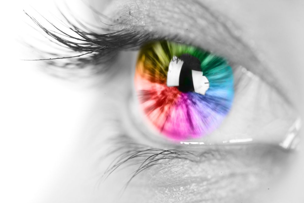
Colours affect our moods and our choices, to a certain extent.
While there are no hard and fast rules, certain colours have come to represent specific ideas and values when it comes to branding.
So, when it comes to choosing colours for your branding, you definitely want to put some thought into your decision and take colour psychology into account.
After all, your brand’s colours are going to show up everywhere, including: your business cards, your website, your signage, your merchandise, and logo.
Colour is a powerful way to enforce your brand. Just think about how synonymous robin egg blue has become with the Tiffany brand — it’s even often called Tiffany Blue!
If it hadn’t been for Coca-Cola, western society’s version of Santa Clause may not be sporting his red and white coat and hat.
So, just as these long-lasting brands have done, you may want to consider taking your brand colours seriously.
You don’t have to follow these guidelines to the letter, but here’s an overview of what colours have come to represent in branding…
Purple branding signifies the finer things in life
Violets and purples signify royalty or luxury. These colours are favoured by brands that want to exemplify the finer things in life.
For example, Crown Royal whiskey has their logo depicting a purple velvet cushion holding up a crown.
Similarly, the purple branding for Cadbury chocolates also implies decadence, which is exactly what a chocolate maker would want you to feel when you’re purchasing their product.
Indigo represents wisdom
Indigo is a colour that hovers between blue and purple and has come to signify wisdom and intuition.
Indigo Books (literally named after the colour) sells books, board games, and pretty candles, and as their brand name and colour suggests, they are about being extrasensory and in search of knowledge.
Blue is a trustworthy colour
The colour blue — particularly dark blue — has become synonymous with trustworthiness and reliability. There’s an old trope that says if you’re ever on trial for a crime, you should wear blue because it will make you look innocent.
Brands that want to convey longevity and ensure confidence lean towards blue. For example, many banks and financial institutions favour blue (Royal Bank of Canada, Bank of Montreal, Amex, Visa, and PayPal) because they want you to trust them with your money.
Brands like General Electric, Boeing, Dell, IBM, and Ford use blue to assure you they are safe, long-lasting, conservative, and reliable.
Green feels refreshing and clean
Green inspires thoughts of the environment, nature, freshness, and health.
The green Body Shop logo reminds us that the company had a strong environmental and humanitarian ethic.
We breathe fresher and cleaner with green branding from Tic Tac and Wrigley’s Spearmint Gum.
Meanwhile, 7up and Starbucks promise to refresh our energy.
Yellow is high energy and happy
Yellow has come to signify high energy and happiness in branding.
The golden arches of McDonalds promise us a Happy Meal — delivered quickly and with a toy!
Diamond Taxi promises to zip us around quickly and effortlessly in yellow cars.
Nikon’s yellow branding reminds us of quick turnaround to see photographs that make us happy.
IKEA’s whacky furniture and meatballs all promise to make us happy, in addition to furnishing and feeding us.
Orange makes us hungry for fast food
Orange is a flashy colour that demands attention now! There’s a sense of urgency with orange, as in something needs to be fixed — and fast!
Fast food chains and snack food brands like Harvey’s, Reese’s, and Fanta have predominantly orange branding, so their message is that they can free you from your hunger or thirst in a fast way.
Home Depot promises that someone in an orange apron will be able to fix your household dilemma quickly.
Red is sporty and fast
Red also represents speed and sports.
Sport Chek, Nike, and ESPN are all sports-related brands that predominantly feature red in their logos.
Wendy’s, Pizza Hut, and Kellogg’s will all have you fed in no time.
Target is one-stop shopping so you can get everything you need quickly under one roof.
Pink is a young and feminine colour
Pink has become synonymous with femininity, youth, and sweetness.
Cosmopolitan, Avon, and Victoria’s Secret are all brands that target women and feature mostly pink branding.
Barbie and Hello Kitty sell toys and merchandise aimed at young girls.
Baskin Robbins and Dunkin Donuts promise sweet treats.
There are always going to be exceptions to these so-called colour “rules” but colour psychology in branding is a reality, so if you are wondering what colours you should be using in your branding, take a look at some time-tested brands and think about colours they use and what feelings they inspire.